
Boat.
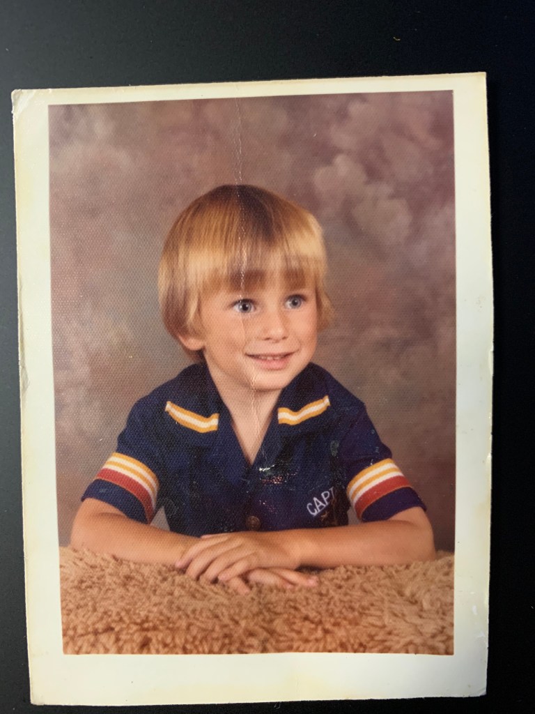
That, according to my parents, was my first word. Growing up I was fascinated by them so much, again according to my parents, I would point and yell, “Boat, boat, boat!” every time I would see one. I remember a class photo in elementary school, maybe grade 1 where I was wearing my favourite shirt… a captain’s shirt. EDIT: I found the photo, and it was actually 1 year before I started school.
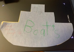
Digging around, I even found a book I wrote in kindergarten. As a former English teacher and proofreader, I sincerely apologize for the apostrophe. In my defence, I was 5.
Looking back throughout my life, I have spent my entire life next to or near a large body of water. Even family vacations and trips were usually on or near the water. With the major exceptions of driving through the prairies to the Rocky Mountains and then BC from Ontario. The 2 times that weren’t spent near a large body of water, would be my 3.5 years in Sudbury at university. But that is offset by the fact there are 32 lakes within its city limits. Most recently, in Pocheon and Yangju, in my last 4.5 years in Korea. The 1 kilometre wide Han River wasn’t that far away at 25 minutes, and the Yellow (West) Sea was only an hour and change away by car.
Taking the ferry to Prince Edward Island, Newfoundland, and Saint Pierre and Miquelon were highlights in my life. My grandfather’s power boat was always fun. Even in Korea, I managed a couple of ferry rides, one to Nami Island, which was far too short to enjoy, and a trip to Hongdo, an island south west of Mokpo in the southwest corner of the Korean peninsula.
Fast forward to 2021. I have become a little more planted back in Canada. My wanting to establish my photography business here in Nova Scotia, Canada, I felt I needed a rebrand. One that was a little more identifiable to Canadians and one where people who didn’t speak Korean, could read my name.
One of the things that I realized was, and it’s going to sound strange, is that it was (and still is a little) weird to hear and speak English all of the time. I was raised speaking English, I had taught English for 17 years, I wrote a Business English Textbook, I edit materials, apps, and scripts that are written in and for English… and yet, hearing it on the streets in an English speaking area of Canada is strange to me. (Insert shoulder shrugging emoji here)
But this weird feeling made me realize that the logo that I have been using to promote my photography in Korea as well as my watermark wasn’t going to cut it here. For the most part, it would just look like a bunch of squiggly red lines in a circle, with no meaning.
Here is the original logo that started with Leigh MacArthur Photography. It is a personal stamp that I had done. These stamps are traditionally used with a red ink, hence the red. It is merely a macro photograph of a real stamp. Let me break it down for you…
In this colourized version, the blue is 맥 which in Korean is “Mac”. The yellow is 아, which is pronounce as “ah”. The green is 더 which is pronounced as “daw”. Which is my last name: 맥아더 (MacAhDaw) or MacArthur. (There are no similar ‘th’ sounds in Korean, so it often gets replaced with either a ‘d’ for the voiced dental fricative or an ‘s’ for the voiceless dental fricative.) The purple 리 is pronounced “Lee”, or in my case, Leigh. Plain and simple, this is just a stamp of my name in Korean. I added English script to it a little later to add to the watermarks on the photos, often followed with a copyright.
So to avoid going through the complete transition that the logo has gone through, I will fast forward to earlier this year. I was looking to make some business cards. I went around to several print shops in the local area, and was a little underwhelmed at what they could offer me. Queue the Google search.
The first name that came up was an address that I hadn’t seen before in my short time here in Kentville. So I went on a hunt to look for it. I found it, but was closed. So I went home and did a little more digging into their website. Some of the designs that they had done were really cool. Then I came across this:
Coins to me are really cool. I don’t have a collection per se, but any coins from different countries or what I think are cool looking coins are kept. The graphic designer I “found” has designed a coin! How cool was that. Well, I just had to meet her.
Bonnie Ross, I learned, has won a number of awards in graphic design and has just the other month had designed a new gold coin with an emerald! The selling price is $4400! The crazy part is that it sold out before the mint had told her that it was up on their site.
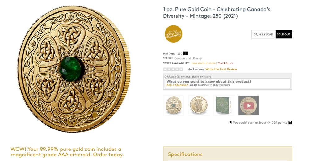
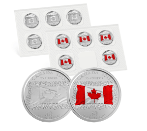
Here is a list of all the coins and stamps that she has done.
I had told her I was looking to do something that would tie me to the area a little more. Knowing nothing of me personally, the first thing she suggested was using a sailboat within my name as a logo. I thought that was a great idea, I had thought of trying to use a tall ship, much like the Bluenose II. We tossed around some ideas, I had thought of using the sails as the M in MacArthur. I worked and worked at it for days. I sent off what I had done, and she asked if I wanted her to give it a go. I said please. The first thing she came back at me was pretty close to what I had decided to be the final product.

The idea of using the Korean logo as a part of the new logo, she explained was to include my international history in photography. It was actually my wife’s idea to move it to the right side and treat it as if it were the moon. The addition of the blue… that blue. I have obsessing over that shade/hue of blue for the last few years. It blew my mind, as Bonnie had, naturally, no idea of this obsession. I also asked to use the original sketch that lead to the idea for the big logo which is now on the back of my business card.
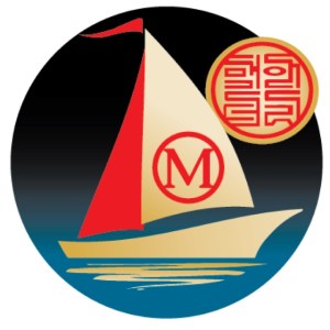
Even in the word mark, the use of the Korean logo as a reflection of the circled M was more than just a nice touch.
I am more than ecstatic to not just have a new logo, one that my wife said when I first showed her the first draft, “Yes, that’s a professional logo. You can see that it’s professional.”, but to have a logo designed by one of the top graphic designers in Canada is beyond my wildest dreams, and the cherry on the top, is the honour to be able to consider her a new friend.
I’ve come full circle with boats. So it’s time to guide it through without sinking.

Leave a comment